Carpet does not need a nostalgic defense. It needs a room in which it looks deliberate. The question is not whether you would put it everywhere, but whether one particular space could be better with a softer, more expressive floor.
House Beautiful’s reporting by Jessica Cherner spotlights a renewed designer interest in wall-to-wall carpet. Here is our own visual exploration: nine newly imagined interiors, with color, scale and the floor itself doing the work.
1. Make a color commitment
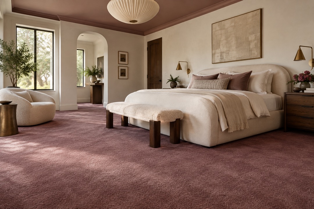
Mulberry carpet is the most assertive surface in our first concept room. A dusty rose ceiling answers it without forcing every wall into the same color. Ivory upholstery provides a pause; dark bedside furniture keeps the composition from becoming sugary. Our take: carry one restrained accent from the floor into bedding, then stop. The carpet should feel like a decision, not a theme.
2. Put contrast underfoot
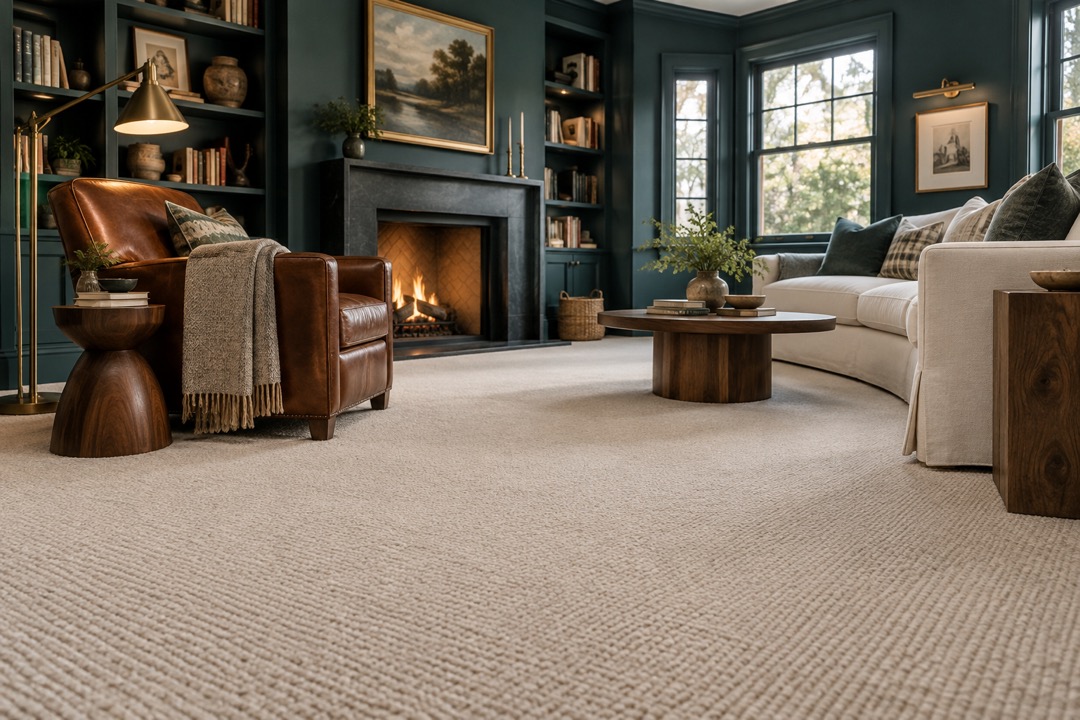
In this teal den, the oatmeal floor is not filler. It is the brightest broad surface in the room, balancing dark joinery and a cognac leather chair. The mix feels collected rather than coordinated. We would keep the coffee table compact enough to leave a generous view of the weave. If the carpet is worth choosing, it is worth seeing.
3. Work at an intimate scale
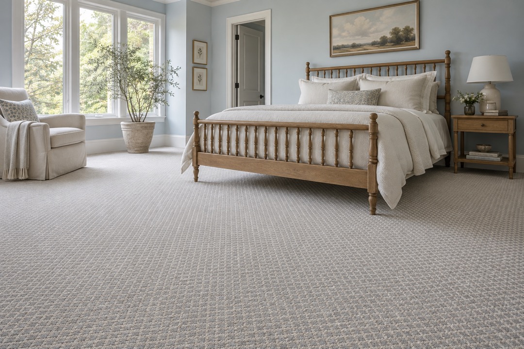
The guest bedroom uses a fine cream-and-grey diamond repeat with pale blue walls and an oak spindle bed. From the doorway, the floor reads as a soft field. Closer in, the pattern becomes a little discovery. Our preference here is plain bedding and just one quietly patterned cushion. Give the eye a clear hierarchy rather than several equally insistent surfaces.
4. Try an unexpected neutral
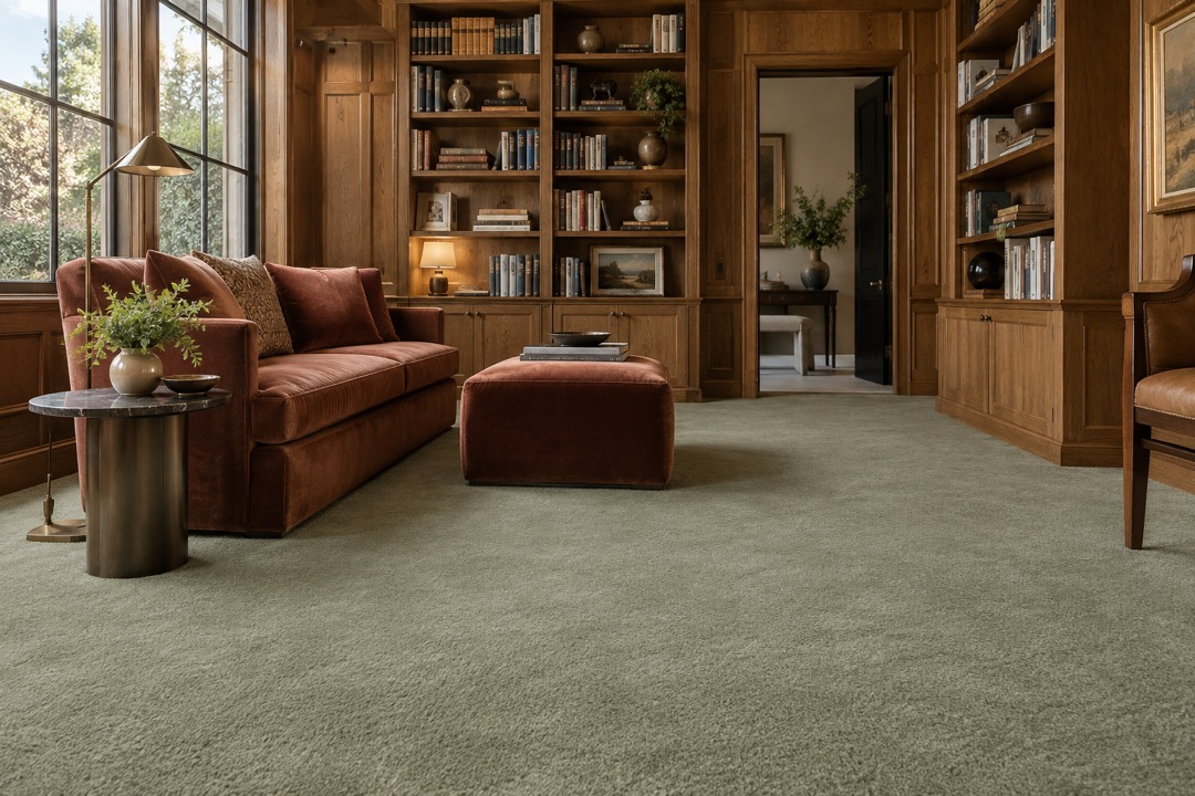
Sage green behaves like a neutral in this oak library because the surrounding colors are warm and earthy. The rust sofa sharpens the distinction between upholstery and floor. We would sample the carpet beside the actual wood finish rather than choose it from a screen. A green that looks serene in isolation can tell a different story next to honey-toned paneling.
5. Let the floor carry the graphic
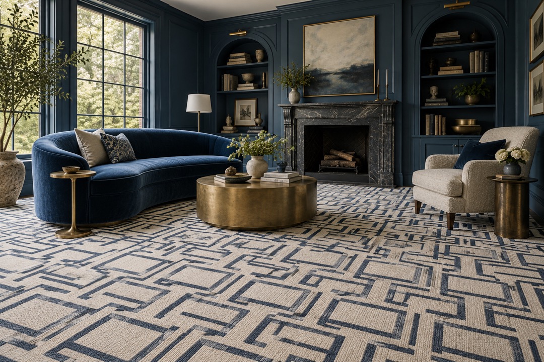
This blue sitting room gives its strongest pattern to the carpet: an angular cream-and-ink composition that continues beneath the seating. The sofa stays solid, the side tables stay sculptural, and the windows supply the movement. Our rule for a floor this expressive is simple: do not make every cushion compete. One confident graphic can do more than a roomful of small ones.
6. Build a mood, not a showroom
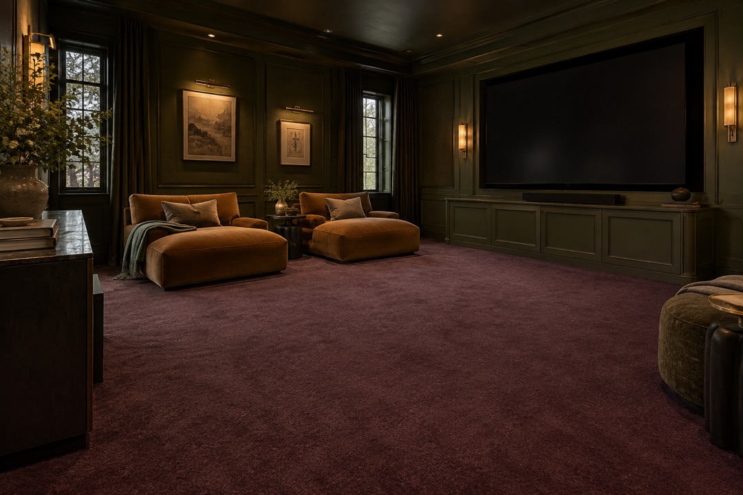
Aubergine carpet, olive walls and caramel lounge chairs make our cinema concept deliberately intimate. Instead of cinema-themed accessories, the room relies on color and low lighting. Our visual recommendation is to test the flooring under the lighting you will actually use at night. A sample approved at noon may not deliver the same effect during a film.
7. Give daylight something to reveal
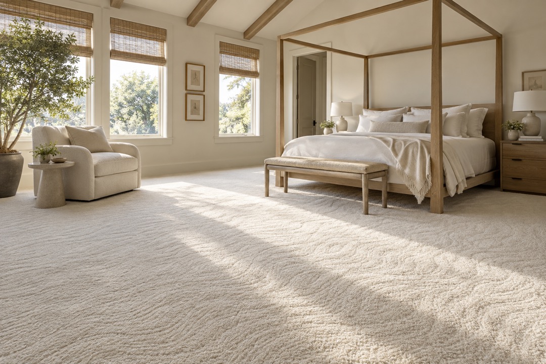
Cream carpet in the canopy bedroom has a gently raised, wave-like surface. The interesting moment is where daylight travels across it, bringing out relief without introducing another strong color. We would pair this treatment with uncomplicated window coverings and linen bedding. Let the texture be the ornament. The image is intentionally quiet enough to make the surface legible.
8. Edit the bedroom down
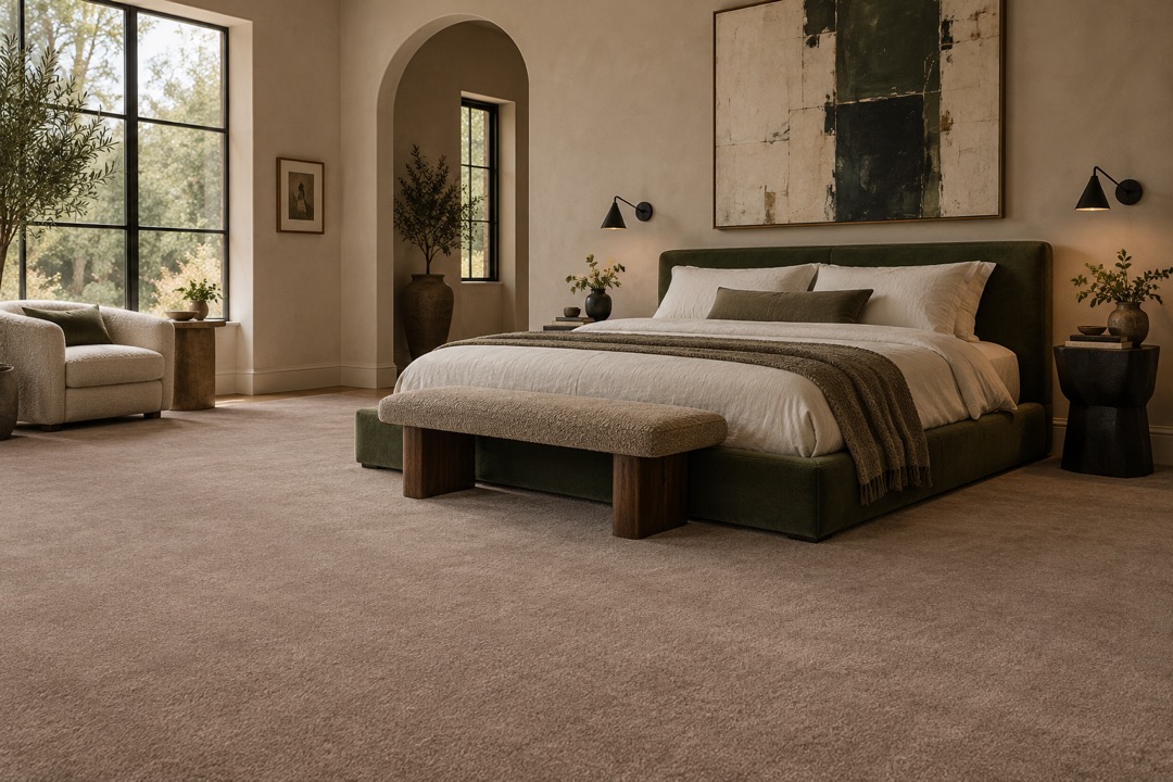
Warm taupe carpet supports a dark green bed and a large abstract painting in this concept. Nothing on the floor asks to be the star, which makes the art and headboard more compelling. We would keep bedside pieces slightly different rather than buy an entire matching suite. The result should feel personal, with the floor serving as a consistent backdrop.
9. Pay attention to the junctions
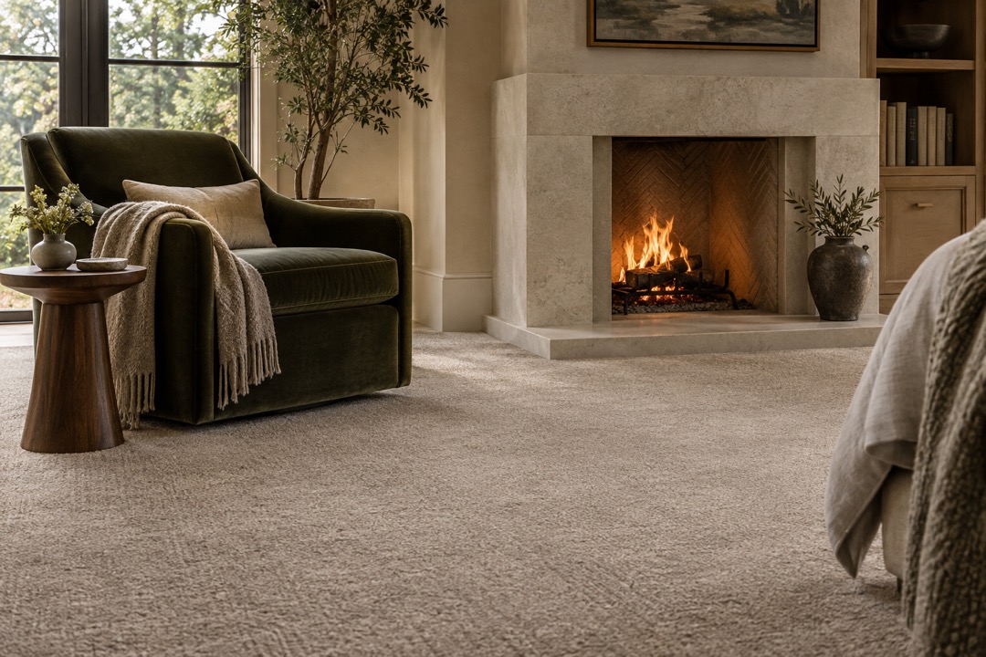
The final image moves closer to the point where greige carpet meets a projecting limestone hearth. That small boundary deserves as much visual consideration as the center of the room. We would review the proposed perimeter details with the installer before work begins, including doorways and other material changes. A beautiful room is assembled at its edges, not only in its photographs.
Our bottom line: choose the room first, then the carpet. Bring home samples, live with the colors in different light, and ask for a clear installation plan. A trend is an invitation to reconsider, not a reason to cover a floor you already love.