Some homes make a case for restraint. Garrow Kedigian’s Paris pied-à-terre makes a much more enticing case for color. It is the kind of apartment that makes a white wall feel like a missed opportunity.
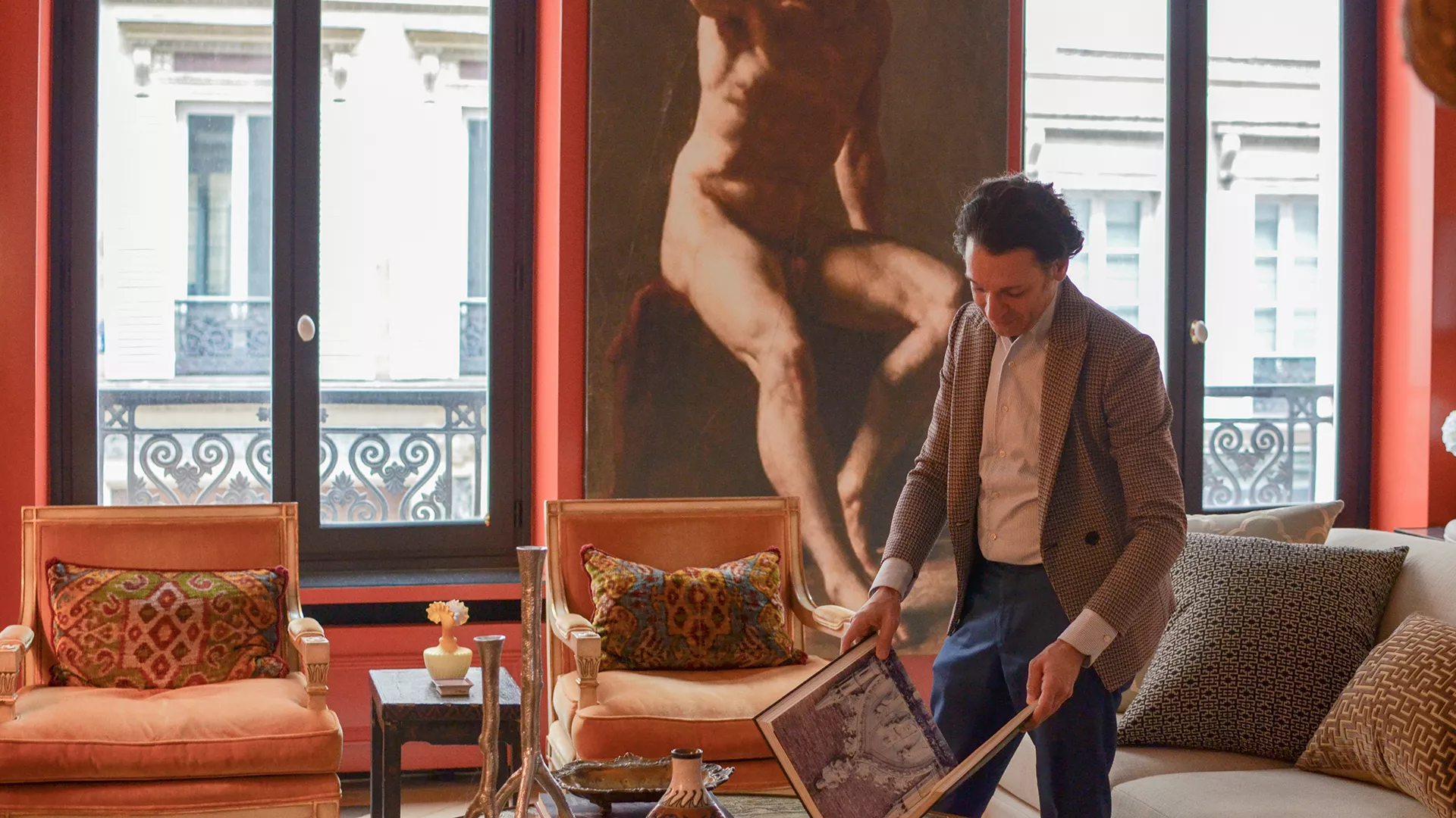
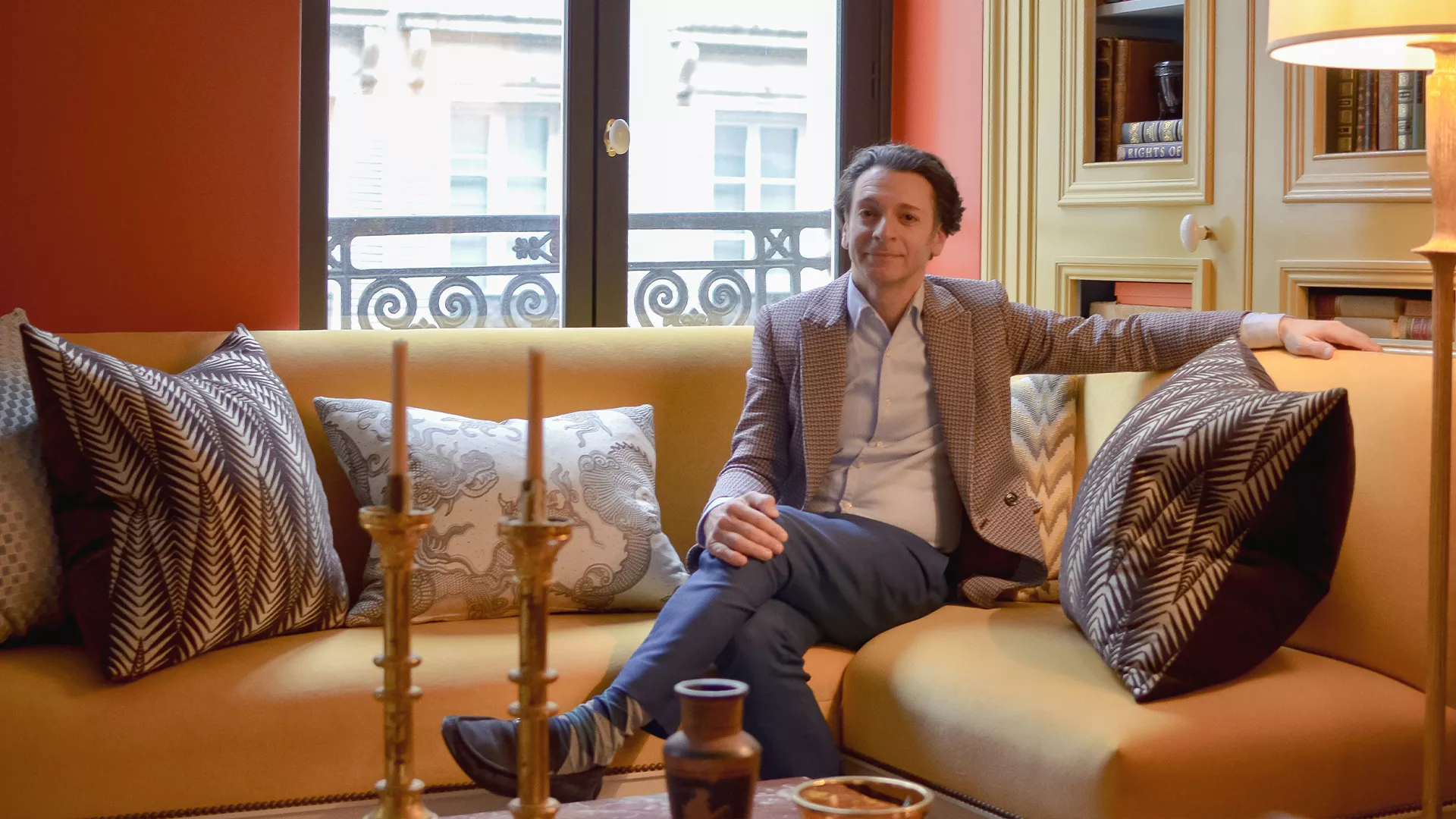
In an interview with Junot, the designer describes a home in Nouvelle Athènes, in Paris’s 9th arrondissement, shaped around symmetry, daylight and entertaining. He expanded the living room into a former second bedroom and used mirrors to amplify its depth. His decorating references range from Asia to Art Nouveau, but his guiding idea is personal: a home should reveal its occupant rather than conceal them. Read Junot’s interview and view the apartment photographs.
The colors are the attraction
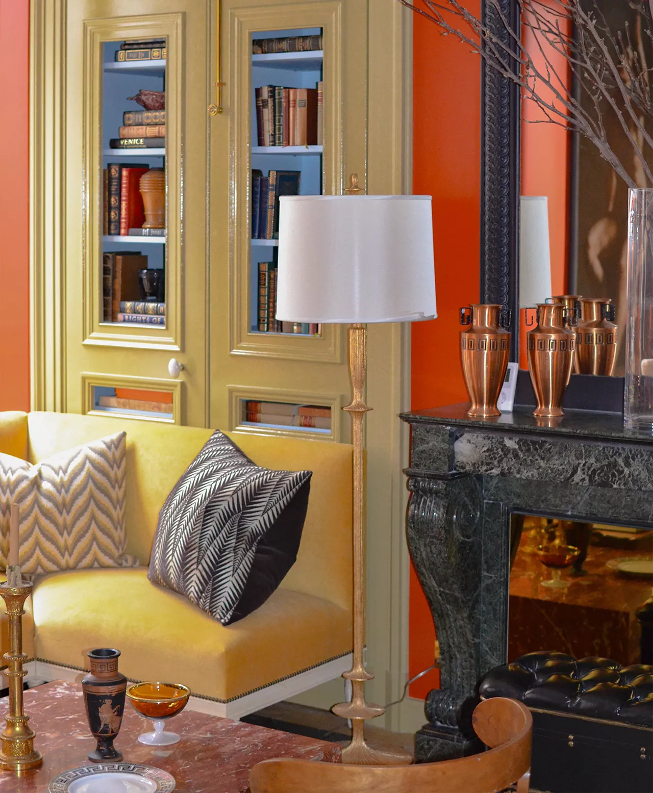
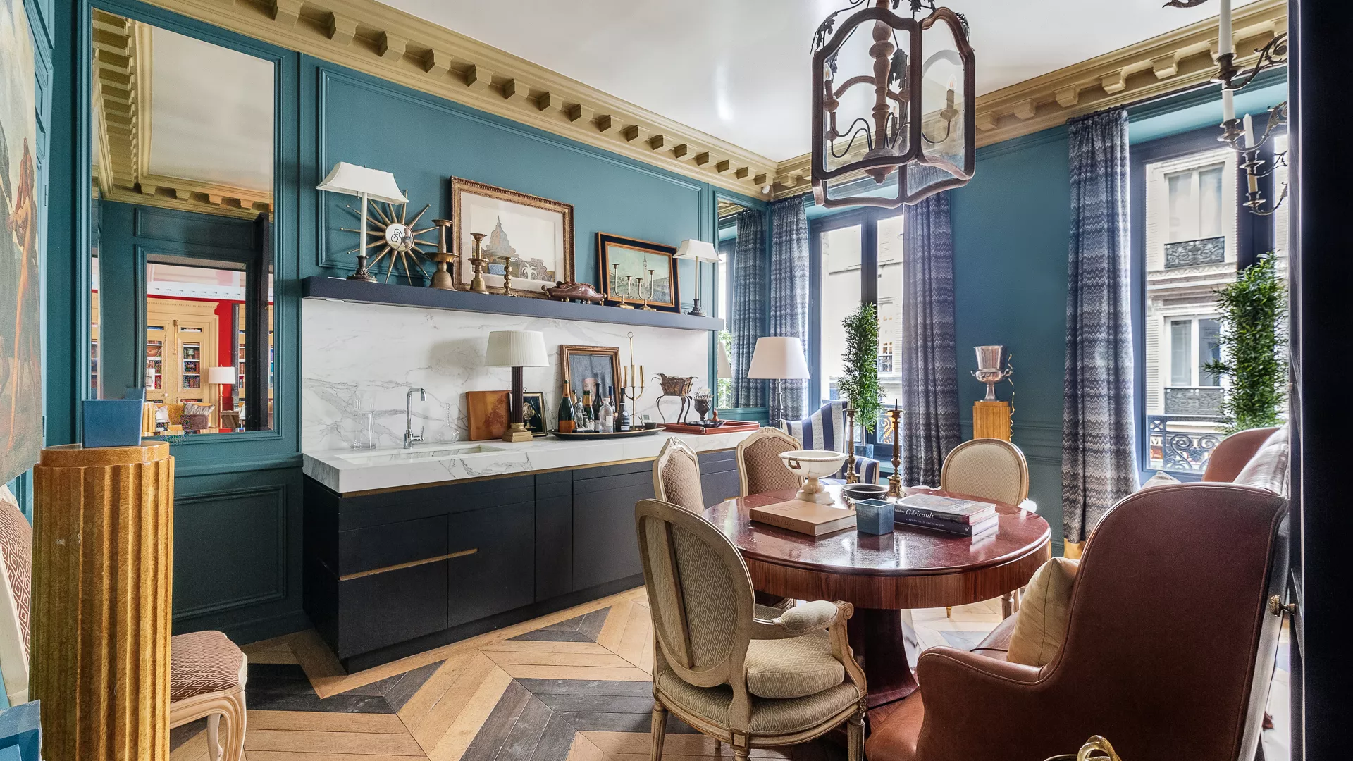
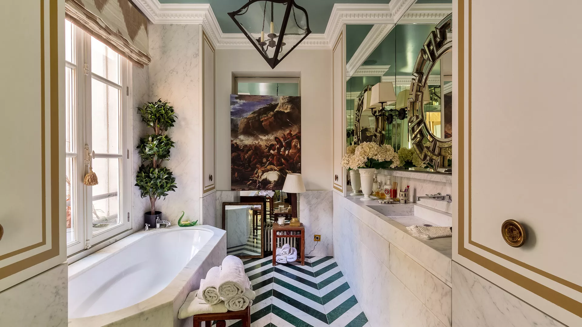
House Beautiful’s September 2023 feature identifies the salon walls as a 50/50 blend of Benjamin Moore’s Dragons Blood and Ravishing Red, paired with a Soft Chinchilla ceiling. Caribbean Teal appears on the dining-room walls; Courtyard Green colors the kitchen. Rattan provides a recurring trim color. Source: House Beautiful.
Those combinations suggest a useful way to think about a palette: not as a collection of favorite paint chips, but as a relationship between rooms. A warm red and a cool teal can each be powerful on their own. Seen in sequence, they give one another a different character. The transition becomes part of the pleasure.
Give the ceiling a role
A ceiling does not have to disappear. Giving it a deliberate color can make a room feel more complete, particularly when the walls already have conviction. The decision is not simply whether to go light or dark. It is whether the overhead surface should soften, contrast with or extend what happens below it.
For anyone tempted to try this at home, start with the whole view. Put wall, ceiling and trim samples together. Look at them from the doorway and from your favorite chair, in daylight and under the lamps you actually use. A successful combination needs to work as a room, not just as a photograph.
Bold does not mean indiscriminate
The distinction between richness and clutter is often repetition. A recurring trim tone, a consistent metal finish or a related wood color gives the eye something familiar to return to. That continuity allows other decisions to be more adventurous.
It also helps to decide what deserves attention. If the wall color is the statement, every cushion does not need to compete. If a textile is spectacular, the surrounding finishes can support it. Restraint still matters in a colorful interior; it simply takes a different form.
A little Paris, without the imitation
The useful lesson for a Dallas apartment or house is not to reproduce a Parisian salon. It is to take your own taste seriously enough to make a decision. Try the saturated dining room. Consider a ceiling that is not automatically white. Choose a trim color because it belongs with the walls, not because it is the default.
Keep the architecture you have in mind, and test before committing. But do not confuse caution with good taste. A home can be polished, comfortable and unmistakably yours without being neutral.
Kedigian’s pied-à-terre is an invitation to look again at color. Not as the finishing touch, but as a reason to love being in a room.
Reporting references: Junot’s interview with Garrow Kedigian and House Beautiful’s September 2023 Paris home tour. Design commentary by The Dallas Registry. Follow the linked Junot tour to see photographs of the actual apartment.